You’ve put in all that hard work. You’ve chosen your niche, crafted that killer podcast name, nailed the script, and even recorded your podcast. But hey, hitting that publish button? It’s not as simple as it sounds, my friend.
You’ve got to get your episode title, description, and podcast cover art all dialed in. Now, I know that first stuff is a piece of cake, but that last bit – how to make podcast cover art? It can be a bit of a head-scratcher, right? No worries, though – we’ve got your back.
So, grab your trusty notebook, pour yourself a cuppa (because who can resist a good brew?), and find that pen because we’re about to break down:
- How to make podcast cover art – a killer one at that
- What you should be paying close attention to when you’re in the creative zone
- The do’s and don’ts of crafting the perfect podcast cover design
Keep in mind color psychology
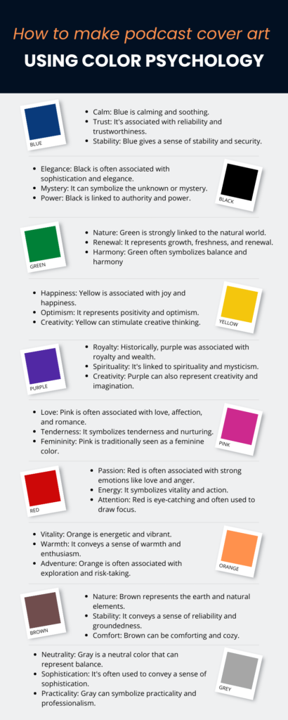
Color psychology is a very underrated but crucial part of how to make podcast cover art. Each color signifies a key aspect. Different feelings are associated with different colors.
Make your design eye-catchy by identifying the emotion you want your listeners to feel when they come across your podcast cover art. How does one even do that?
Take a look at your content and its purpose. Now ask yourself – what do you want your user to feel when they listen to your podcast? Do you want them to laugh out loud, or get a bunch of knowledge and feel awe.
Once you’ve figured that out, the next step is a piece of cake. Refer to the chart below to figure out which color scheme will fit your podcast cover.

Don’t write the episode name in the podcast cover art
There’s cover design for your overall podcast. Adding the name of your podcast in it is a no-brainer since it’s a representation of the podcast. But, the individual episode should also have a cover art. Putting the name of the episode on the cover is a waste of space.
Instead, use exciting and curiosity generating words. An easy trick to find such words is to take a phrase within the podcast that can shock people. Keep the phrase short because the episode cover art appears small to listeners. Overcrowding can create clutter.
Using reaction faces draws people in
Alternatively, you can forego phrases and just use your face in the cover art. Try imitating the emotion you want your audience to feel in your face, and use that reaction face in the cover art.
If it’s horror or fear you want your listeners to feel, use a scared reaction face in the cover. Avoid stock images because they might not connect with your audience as much as your face. They’re also overused and thus end up being bland in the sea of cover arts on platforms.
Have consistent color scheme and fonts
Picture this: You’re going through someone’s podcast and you see one cover in a rich purple color and the next in neon green. Scrolling further down you’ve seen all shades of VIBGYOR that make no aesthetic sense. It will not only confuse you but might also make you avoid the podcast.
Having a consistent color scheme gives your podcast a cohesiveness and personality. The same goes for fonts too. Having a consistent font in all your cover art is pleasing to the eye and sets the tone for your podcast.
You can also experiment with mixing two fonts but generally avoid using more than two fonts. A crucial part of how to make podcast cover art is to keep it aesthetically appealing and eye-catching.
Podcast cover art size is important
How to make podcast cover art that even the podcast directories like? Each platform has a different requirement but keeping it either 1400×1400 to 3000×3000 pixels keeps you in the good books of most podcast listening platforms. These sizes ensure that your cover art appears crisp and charming across different platforms.
Look to others for inspiration
Reading all the tips in the world is one thing but actually sitting down and designing is a completely different beast. Looking at a blank screen is nobody’s idea for fun, so instead steal like an artist.
When deciphering how to make podcast cover art check out the podcast covers of your favorites or those that are doing well in your niche.
Do not copy their covers. Find something that appeals to you and notice what draws you in. Was it the font? The color scheme? Or the images they used? Then incorporate that in your own podcast cover.
Another underrated place you can check is YouTube thumbnails. Yes, we know that you’re making a podcast cover and a YouTube thumbnail is completely different. But, you’re missing the point.
YouTube thumbnails are some of the best places to learn what appeals to specific audiences. They’re a free masterclass on learning what draws people in and makes them curious. So, go check out some thumbnails and see the insights you’ll get from them.
Big font size
Another trick in the book to make your podcast cover art eye-catching is to use a big font. The podcast cover art appears really small across platforms and the listeners have a wide array of options.
You may have written a killer copy for your podcast cover but if it’s not visible to your listeners, it will not give you any solid results. Thus, a crucial puzzle piece of how to make podcast cover art is to keep the font big.
Keep the iconography and content in sync
Apart from color, and font, iconography is super important. The icons you use in your art should match the content you’re producing. Funny podcasts will have a vastly different iconography than a business podcast. When you’re sifting through resources and gathering insights, keep this tip in mind on how to make podcast cover art.
Negative space is key
The art of creating good design is to strike a balance between the elements and empty space. Your cover art cannot be a jumble of things. You need to give some space between and around your elements for it to look classy and elegant.
Blank space also helps the viewer to perceive your messaging better. So make negative space your best friend and do not feel the need to fill it unnecessarily when working out how to make podcast cover art.
Tools you can use to get started
We’ve given you some unique tips on how to make podcast cover art, but which tools do you even need to make one? Some tools you can use to get started with your podcast cover art are:
- Canva: Canva offers a wide range of templates and design tools to create social media graphics, posters, flyers, and more. If you’re part of the Hubhopper Tribe (hello!), we have a Canva integration to help you directly import your podcast cover art when creating a podcast or uploading an episode.
- Remove.bg: If you don’t have Canva premium, you would need other tools to make up for it. Once Canva premium feature is removing the background of an image. remove.bg is a tool you can use to remove the background and download it.
- Pixabay: To get a wider library of stock images, Pixabay is a good tool. You get vectors, images, animations and more.
Adding animation
Another great tip of how to make podcast cover art and can catch people’s eye on these busy platforms is to use a cartoon version of your face. You don’t need to go overboard with it, but making it a cartoon retains your identity but also sets you apart from others who are simply using their faces.
There are creators who do use cartoons as their cover art. But, not many people are doing it. Side note; a serious podcast should not use these tips because as we discussed the tone of your content should match your cover art.
Create intrigue but don’t click-bait
We discussed using reaction faces and catchy phrases to capture attention. But, you need to deliver on the promise you made.
If the cover art is just click-baity, guess what? You’ll not get those precious downloads and most importantly you’ll lose the trust of your avid listeners. So when you’re thinking about how to make podcast cover art, don’t be click-baity.
Now that you have the tips to create a pretty great podcast cover art, here are some do’s and dont’s that you can keep in mind:
- Avoid explicit imagery or words in your cover art. If they are key to your podcast, censor them.
- Compress your cover art so that it’s mobile-users friendly. You can use TinyPNG to compress your PNG. The quality of the PNG will be uncompromised.
- When you’ve made your cover art, preview it at a small size (30×30 pixels) to see what your listeners will view once they end up on your podcast.
- Avoid overused imagery. Many people use microphones or headphones despite not being in the gadgets niche. Just because you have a podcast doesn’t mean you have to use mics or headphones. Stick to imagery that makes sense for your niche.
- Use high-resolution images when making your podcast art. It would look crisp on your art cover and appeal to your audience.
- Avoid images or words that are intellectual property of other brands.
Make the best podcast cover art
You now know the secrets of how to make podcast cover art. Just follow these easy tips and tricks, and I am sure you will create some magic. Just an overview of everything:-
- Remember to keep the cover art similar to the content you produce.
- Colors, fonts, and iconography play an important role and finding ones that are in sync with your podcast is the key to getting those ears to listen to you.
- Going the unconventional route and setting yourself apart from the crowd by using reaction faces, less words, and cartooning the podcast cover can also get you some eyeballs.
We hope you liked the blog on how to make podcast cover art and it helped you get that brain of yours jogging.


